Office Design: Inspirations and Colour Choices
As construction moves forward, the design of our new office is coming together beautifully. Our vision was to create a space that fosters professionalism, inspires productivity, and embodies our connection to the Geelong community while reflecting the strength and integrity of our firm’s historical brand.
One of the unique advantages we’ve had in this process is the expertise of our Marketing and Office Manager, who has studied design at Swinburne University and has a deep passion for interior design. We are incredibly fortunate to have her keen eye for design as part of our team.
Keep reading as Sally walks us through the key inspirations behind our office design and colour selections:
The key to designing this office was creating a space that feels both grounded in professionalism and in harmony with the surrounding beauty of Geelong. One of the primary ways we’ve achieved this is through a thoughtful, nature-inspired colour palette that not only reflects the brand identity of our law firm but also incorporates the calming tones of the Geelong Waterfront.
Colour Palette: Reflecting Our Brand and Geelong’s Waterfront Serenity
We wanted the office to feel connected to the location of the office, and the colour selections were a big part of this. For example, the carpet colours were inspired by the water and sky of the waterfront. Soft blues mimic the hues of the ocean, and lighter shades evoke the sky’s openness, creating a peaceful foundation throughout the space.
To bring warmth into the office, we incorporated warm tan tones and natural timber accents. These materials reflect the earthy elements of the local landscape, grounding the space while balancing the formality required in a professional setting. We want clients to feel welcome but also know that this is a place of serious, focused work.
Our firm’s signature branding colours—navy, white, and black—have been integrated into the design as well. These strong colours convey a sense of reliability and professionalism, but they are complemented by softer, natural hues to ensure the space doesn’t feel too rigid or cold. The contrast creates a balance that reinforces both the strength of our brand and the approachable, human side of our firm.
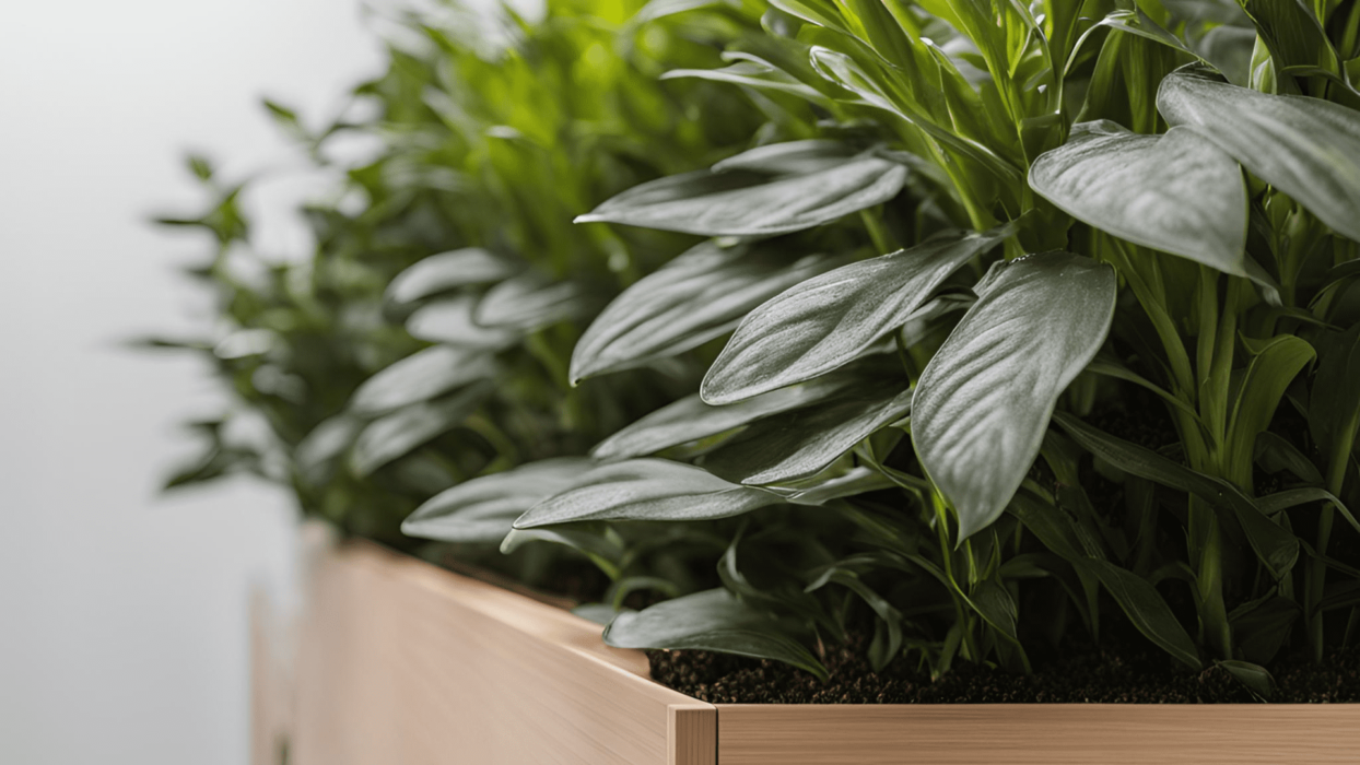
Lastly, the biophilic colour harmony comes into play with the vibrant greens from the plants we’ve chosen. These tones mirror the natural surroundings outside the office, particularly the trees and grassy areas of the waterfront. This approach ensures that the interior space feels cohesive with the view outside, enhancing the sense of connection to nature, which we know is important for creating a calming, productive atmosphere.
Biophilic Design: Integrating Nature into a Professional Space
Beyond colour, we’ve integrated biophilic design principles throughout the office, primarily by incorporating plants throughout the workspaces. This choice goes beyond simple decoration. Plants reduce stress and improve focus, providing crucial benefits in a high-performance legal environment. By placing plants in key areas, we’ve introduced a natural element that brings organic beauty indoors while supporting the team’s overall productivity.
The view from the office is spectacular, and the plants help maintain a connection to that natural landscape. The greenery inside reflects the lush outdoor surroundings. Ultimately, tying the design together reinforces our commitment to the environment and the community. It’s about creating a workspace that feels calm and balanced. Supporting the staff’s focus and creating a welcoming space for clients.
With the plants selected and the colour palette firmly in place, the design is coming to life. We’re excited to see how all the elements will work together. Creating a space that feels fresh, dignified, and aligned with the needs of our firm and the Geelong community. It’s all about blending professionalism with natural beauty, and we’re eager to see the final result.
To stay updated with the latest news and progress, stay connected with us:


Leave a Reply